How to theme Drupal 7 with Omega 3
Despite I am giving advices of theming and design. I am not a designer… I am a developer and the best I can do is to make something look good yet functional.
This tutorial is based solely on my experiences of Drupal 7 and Omega 3.
Requirements; you should know some HTML & CSS basics.
When it comes to Drupal subtheming. Omega is one of the best base themes. It is 100% configurable and HTML5 optimized. How is that we are supposed to theme Drupal with Omega? That is what we are going to discuss in this article.
Creating the subtheme
The very first step to theme with Omega is to create on of its subthemes. The best way to create a subtheme is using Drush and Omega tools. This can be made by typing this command.
drush omega-subtheme mysubtheme
Unfortunately, we will not discuss a thorough description about the subtheme creation in this article. However, you can find more information in the “Omega subtheming” section of the Omega documentation.
Once you create the subtheme and set it as default. You will see a bunch of odd blocks and pink lines. Those are the sections being highlighted to show its spacing, width and height. In order to turn off that, simply uncheck the tiles at the right (temporary) or go to the options and turn off the debugging options (permanent).
Omega structure
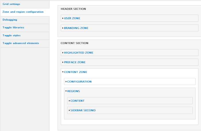
Omega has a structure based on a grid divided in many parts; zones, regions and sections. This arrangement may vary depending on the modifications made in the .info file.
The regions are the smallest pieces of Omega structure. Being more specific, they are the columns of the grids. They are supposed to hold the rest of the content (the blocks, Views, …). The number of columns for each one can be configured. As well as the prefix and suffix (empty columns to fill unused spaces). The arrangement of the regions may change depending on the device (this can be configured in the options). You may expect that each region has its own margins (other properties such as “width” are also set). Therefore, changing these properties via CSS for any reason is highly discouraged.
The zones are the containers of each grid. There will be as many grids as many zones are. The grids have a number of allowed columns up to 24 columns. Each zone can have its own configuration, so maybe one zone has 12 columns and another has 16 columns. Unlike regions, they take all the screen horizontally and they can only be arranged vertically. The zones can only hold regions and nothing more.

The sections are containers of the zones. Their width takes all the screen and their height depends on the content that they hold. Unlike the zones and regions, they can not be ordered (or even created) by the user. There are just three of them; the header section, the content section and the footer section. They must be considered as static content wrappers. For example, the header, content and footer sections should not be moved from their positions. If they were changed the content may lose meaning or sense. There are no ways (at least in Omega) to create or arrange the sections. However, you can create more section by hacking Omega.
Overriding the templates
The method to override an existing template is exactly the same to the default way. The only thing to keep in mind is that the templates to override are in the “templates” folder of Omega. Technically, Omega is a subtheme of Alpha (Omega is a group of Base themes. Alpha is just one of theme). Therefore, all the templates are in the “templates” folder of Omega and Alpha. In order to override one of these templates, copy the template of the “templates” folder of Omega to the subtheme.
Omega provides templates to override each part of its structure (the zones, regions and sections). You may expect for each template a variable holding the content ($content). The content wrapper and the entity wrapper (in other words, another wrapper enclosing the given the zone, region or section). However, the sections will only have the content and its wrapper. Omega sets attributes to the content and entity wrapper in order to set required properties. For example, Omega adds CSS classes through this way to set the proper width to each region. Therefore, modifying these attributes is highly discouraged.
When templating the regions, it is good to add or modify code only inside the entity wrapper. As it was said before, adding CSS properties such as margins, paddings or anything similar to the regions is highly discouraged. There are other properties that can break the layout as well. The border property is one of them, so the “box-sizing” property should be used along with it. Remember that the regions represent the columns in the grid. Their width and position can vary.
The zones have not the same restrictions as the regions, so you can add all the code needed wherever you want it to be. However, the content wrapper has CSS properties that should not be changed. The entity wrapper for all the zones may appear on certain conditions. Any space outside the content wrapper can be used to specify a part in the webpage which its width takes all the screen. Let us see an example, this is the highlighted section of this website. As it can be seen, the highlighted sections takes all the screen from left to right. You can not do that with a region. The right approach to do so is to use the zone to take all the screen like that.

Adding CSS
In order to give color to the website the CSS files must be written. Omega provides some CSS files to implement the code to the theme. Those files, as the rest of the theme, were built on the “Mobile First” methodology. This methodology is based on serving the design to mobile devices and then adapting it to devices with greater resolution. Specially because a mobile device has fewer capabilities (by now) and smaller space than the desktop computers. Adapting a mobile design which consumes lower resources to a desktop design which consumes higher resources is easier than doing the opposite.

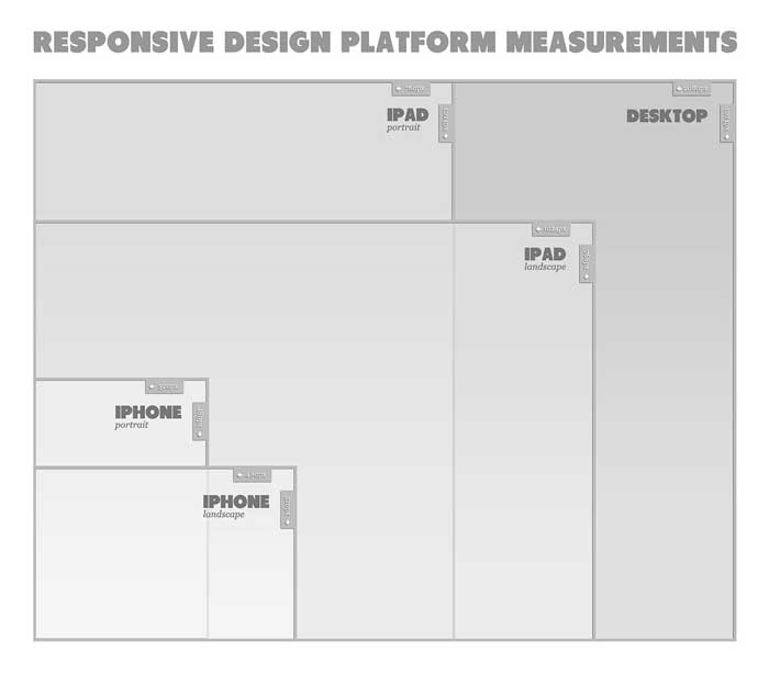
The CSS files will be displayed in a specific order according to the screen size of the device accessing the website. Starting with the file displayed for mobile devices. These files are described bellow.
0px - 740px:	global.css

741px - 979px:	global.css + default.css + narrow.css

980px - 1219px:	global.css + default.css + narrow.css + normal.css

+1220px:	global.css + default.css + narrow.css + normal.css + wide.css
All these files are described in the “Omega theory” section in the documentation of Omega. As it can be seen, each file has a starting device type where is being shown for the first time. From that device type, the file begins to be shown for the rest of the devices. According to this description, the “global.css” file is displayed all the time. This file must have all the colors, images, styles, animation … everything. This file must present the information for mobile devices. The other files will generate a backup/fallback for the other devices. Formatting the existing arrangement to present the information as desired. Non-mobile devices such as tablets, laptops and PCs are shown starting from the “default.css” file. Therefore, the “default.css” file is the proper file to add CSS code for the non-mobile devices. You can place more CSS files as you like. For example, you may like to set another CSS files to make the website “print friendly”. In order to do that just add some few lines to the “.info” file. (like this;)
css[<the given CSS file>][name] = 'The name of the file'

css[<the given CSS file>][description] = 'the description of the given file.'

css[<the given CSS file>][options][weight] = '10 (apparent order of the file)'

css[<the given CSS file>][options][media] = print (print, screen, ...)
Every content wrapper and entity wrapper have a class and a specific ID with a common pattern (usually the class and the ID always are the same). This naming convention gives a way to refer to any part of the Omega structure in all the CSS files. The patterns for the regions, zones and sections are described as following; The content wrappers of the regions just have two classes. The first one is “region-inner” and the second one is “region” followed by the name of the region and “inner”. Everything separated with hyphens. The entity wrappers of the regions usually have “region” followed by the name of the given region separated with a hyphen. The content wrappers of the zones usually have “zone” followed by the name of the given zone. The entity wrappers of the zones usually have “zone” and the name of the given zone. Additionally, it has “wrapper”. Everything is separated with hyphens (remember that the entity wrapper of the zones may not appear). The content wrappers of the sections always have “section” followed by the name of the given section separated with a hyphen.
This would be an example of all the patterns in the structure:
<!-- this is a section -->

<div id="section-<section name>" class="section section-<section name>"> <!-- content wrapper -->

  ... content ($content) ...

</div>

<!-- this is a zone -->

<div id="zone-<zone name>-wrapper" class="zone zone-<zone name>-wrapper"> <!-- entity wrapper, it may not appear -->

  <div id="zone-<zone name>" class="zone zone-<zone name>"> <!-- content wrapper -->

    ... content ($content) ...

  </div>

</div>

<!-- this is a region -->

<div id="region-<region name>" class="region region-<region name>"> <!-- entity wrapper -->

  <div class="region-inner region-<region name>-inner"> <!-- content wrapper -->

    ... content ($content) ...

  </div>

</div>
For more information you can visit “CSS IDs and Classes in an Omega theme: a general outline”. Additionally, the documentation of Omega also describes each part of the structure separately in the “Omega CSS Strategy Explained” section.
Layout arrangement
Unlike themes built from scratch. Omega allows to change the layout structure through the options of the theme. There is no need of programming skills to arrange the layout. When doing it, make sure you have completed all the customizations needed. Omega lets change the order of every zone or region. The structure of the website itself must be changed with these options. In other words, whether the logo is located at the left side of the header. Whether it is in the center. Whether there are three or four columns in the footer. All these things must be changed using these options.

When arranging the layout you can set CSS classes to the regions. Thus, defining all the styles that can be assigned to many elements as CSS classes is a good idea. Try to pay special attention to this because the layout arrangement it is a key phase of Omega theming. Besides, you would save a lot of time doing this and you would add extra functionality to the theme.
Gathering all together
Although we have seen almost everything what we have to know about Omega theming, all this information might be just theory, so we are going to see some practical guidelines and tips of how you should use it:
- Before doing anything you should have an idea of the design that you are going to write down in the theme (just saying).
- The common steps to theme with Omega are the following (or, at least, I would follow these steps); ( create a subtheme ) -> ( modify the HTML structure by overriding the templates if needed ) -> ( write the CSS files ) -> ( arrange the layout to make the theme look as planned ) -> ( blocks, views, writing content, … )
- The design of the website and the Omega structure must match somehow, the very first step to do this is defining all the zones and regions that you are going to use, the default regions and zones brought by default with Omega are handy, but, you must be sure that those are enough for you, if it is not, then define as many region and zones as you need. Make a good use of the Omega structure, the structure of Omega is good enough to handle any web page, it is really important to think about the possible zones and region of the design, you do not have to think about blocks or any other thing (by now), remember that the zones are the containers for the grids and the regions are the columns itself.
- There are a couple of zones or regions that you are more likely to override, for example, the menu region and the branding region, those regions can be overridden to modify the content of those region in case that some options are activated such as the main & second menu, the slogan or the logo. Additionally, there are some design which require a zone pretty different of the other zones, the templates of these zones are candidates of being overridden, although Omega is HTML5 optimized, you can override the template of a region to set special semantics (aside, section, article, …).
- In order to make the theme layout look as the design, you must arrange the regions in the options of the subtheme, if the logo in the design is in the center then place the branding region in the middle of two region (that surely will have a divided menu), if the logo is at the right then arrange each region properly.
- Once the zones and regions are arranged, set the blocks to its corresponding regions, all the regions will be shown in the blocks option of Drupal, in other words, this would represent to assign the content of the website.
- All the sections are the background of the whole theme, make sure to set the proper colors and images for each section.
- Try to make a proper use of the CSS classes, you can use CSS classes to assign the styles to the regions, some other modules such as Panels and Views can use this as well (even CKeditor can use CSS classes).
- Use the naming pattern of Omega to give the proper look to all the desired parts of the layout using CSS, most of cases, the header, content and footer sections, along with the sidebar (first & second), branding and menu regions, are always customized.
- Never use any property that can break the layout such as border, margins or paddings, this also includes position properties with “absolute” value (“position:absolute”).
- Most of cases, toggling off the unused stylesheets is encouraged, check if the theme really needs the “Menu styles”, “Omega styles”, and any other stylesheet, this can be found in the “toggle styles” section in the options of the theme.