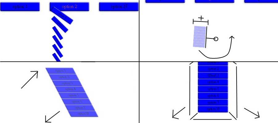
CSS3 showcase. dropdown menu revisited
The behavior of the effects may not be displayed the same way for every browser.
Requirements: You should know some HTML basics. You should know some CSS basics and CSS3 animations.
In this article we are going to show some CSS3 animations based on a dropdown menu that we worked on before as well as the explanation of each one. These animations were built using CSS3 2D transforms. In fact, this is just a simple way to show the greatest things that you can do with the next generation web technologies.
Before start
Before showing anything we must know how and where the animations are going to be implemented. The method is pretty similar to the method used to create the dropdown menu, like this:
ul.menu li:hover ul, ul.menu li ul li:hover ul{
display:block;
animation:effect 1.5s;
-webkit-animation:effect 1.5s;
-moz-animation:effect 1.5s;
-o-animation:effect 1.5s;
animation-play-state:running;
-moz-animation-play-state:running;
-webkit-animation-play-state:running;
-o-animation-play-state:running;
}
We are going to show the animations by each combination of the ‘transform’ property up to four combinations. There are some other properties that will be affected such as the opacity or the margin.
Rotate + Translate
The demo of this animation was posted on JSFIDDLE.
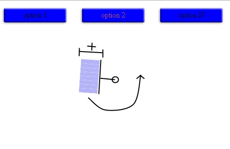
This effect consist in rotating an element a couple of time, but if we use “translate” function. The element will move while it is still rotating just like a satellite in orbit. If we add a “scale” function with an “opacity” property the element will rotate and growing while appears until it reach its normal appearance. It is important to use a “linear” timing. If not the animation will perform oddly.
@keyframes rotatetranslate
{
0%   {transform: scale(0,0) rotate(360deg) translate(-500px,0);opacity:0;}
30%   {transform: scale(0.3,0.3) rotate(0deg) translate(-200px,0);}
70%   {transform: scale(0.7,0.7) rotate(-360deg) translate(-50px,0);}
100% {transform: scale(1,1) rotate(-720deg) translate(0px,0);opacity:1;}
}
Translate + Scale
The demo of this animation was posted on JSFIDDLE.
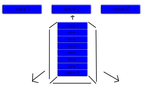
With this combination we will attempt to make a bounce effect. In this case we will use the Y axis of the “translate” function. The “scale” function will make grow the element until the “translate” function reach 0.8em on its Y axis. Then it goes to its normal position and appearance. We would have made the same effect with the “margin-top” property.
@keyframes scaletranslate
{
0%   {transform: scale(0,0) translate(0,-1.8em);}
95% {transform: scale(1.1,1.1) translate(0,0.8em);}
100% {transform: scale(1,1) translate(0,0em);}
}
Scale + Skew
The demo of this animation was posted on JSFIDDLE.
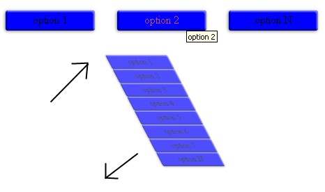
I think about this effect as shapeless. Well, it would be like a fade in effect with an inclination involved. It is not that great but it is still an effect.
@keyframes scaleskew
{
0%   {transform: scale(0,0) skew(90deg,0);opacity:0;}
100% {transform: scale(1,1) skew(0deg,0);opacity:1;}
}
Child manipulation with new CSS3 selectors
What does this have to do with the topic being discussed. There are new CSS3 selectors that let you set properties for specific child elements. If we set the animation to each button and not to the menu itself. We can create a chain effect by overriding the default animation time of each child with the proper selector. We would declare the animation to each child and not to the menu like this:
ul.menu li:hover ul, ul.menu li ul li:hover ul{
display:block;
/*DON'T SET ANY EFFECT TO THE MENU!!*/
}

ul.menu li:hover ul li a, ul.menu li ul li:hover ul li a{
animation:effect 1.5s;
animation-play-state:running;
}
In this sentence we would be declaring the animation and the default time to perform the animation. In order to override this time depending on the order of each child. A sentence for each child with the proper selector must be set:
ul.menu li:hover ul li:first-child a, ul.menu li ul li:hover ul li:first-child a{
animation-duration:1s;
}

ul.menu li:hover ul li:nth-last-child(2) a, ul.menu li ul li:hover ul li:nth-last-child(2) a{
animation-duration:1.8s;
}

ul.menu li:hover ul li:nth-child(2) a, ul.menu li ul li:hover ul li:nth-child(2) a{
animation-duration:1.2s;
}

ul.menu li:hover ul li:last-child a, ul.menu li ul li:hover ul li:last-child a{
animation-duration:2s;
}
The animation time of some children are being overridden in this sentence depending on the default time of the animation and the order of the children. Specifically the first, second, second last and last child. The default time is 1.5s, so the time for each child was set depending on this value. If we were going to change the first child then the value would be 1s. If we were going to change the last child then the value would be 2s. Those are relative values to the default time. Be aware that the animation will last the greatest value set (2s in this case). This will trigger the animation of each child almost consecutively.
Rotate + Scale
The demo of this animation was posted on JSFIDDLE.
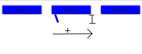
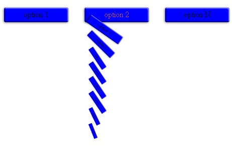
We can do many things with these two functions. Specially if the object is rectangular. If it is that so, we can rotate the object to 90deg and shrink it with the “scale” function. Then we would make it turn to its normal stage while it grows. During the animation we make the element stay at left until it reaches its normal appearance. This will make the shrunk element fit its normal height. The chain effect of this animation looks awesome (a personal opinion).
@keyframes rotatescale
{
0%   {transform: scale(0,0) rotate(90deg); margin-left:-3.8em;}
100% {transform: scale(1,1) rotate(0deg); margin-left:0em;}
}
Translate + Scale (chain effect)
The demo of this animation was posted on JSFIDDLE.
The bounce effect can also be set to each child. It looks pretty cool. Just set the animation to each child and override the default time to the specific children as before. You can even make the same with the rest of the animation, unfortunately they will not look so good.

Latest words
Using 2D transforms is highly encouraged. It is supported by a great number of browsers and it has a better support than 3D transforms (anyway, if you still want to use it I will not blame you). You can also try making effects with other properties such as the width and height. Just remember to test if something goes wrong.