Web design for programmers
Despite I am giving advices of theming and design. I am not a designer. I am a developer and the best I can do is to make something look good yet functional.
EDIT: I came from the future just to tell you not to read this. It is very old and as mentioned above I am not a designer. You may have better references and Ideas by checking out Material Design
Everyone has innate skills. Maybe some people more developed than others. Although you can also develop any skill that you like, you need time and effort to develop it. No one have a warranty to succeed. People who are not talented are more likely to fail developing some skills, but even if you succeed no one can be expert on many skills. There is a myth that speculate about some people that are adept on programming and designing. Something that I honestly still consider a myth. Even if it is true that programmer/designers exists. They could be just a few, but does this mean that programmers are doomed to create ugly user interfaces?, I will try to explain the act of “making things look good without losing its functionality” calling it “design” from now on. Remember I can not explain how to design, but I will try to give “tips” to make the UI a little bit better.
Mockups
First of all, you will need to know exactly what will you do. The perfect way to figure out what you need to do is making a prototype, more specifically a mockup. This will give you a base to work on. It will show you the order of the information. This works a similar way software development works. You are supposed to make a model of the system that will be made by any means necessary, DFD, UML or any other method. skipping this step will lead to a system hard to develop and maintain with a messy code and a questionable performance. Designing works the same way. If you do not make a model of the design, perhaps you will not get the best results. When crafting the mockup analyze and define the navigation of the website. Keep in mind that although the information flows in different ways through the pages. The navigation should be pretty similar on every page, in other words, you should define a navigation pattern that is going to keep the same steps for every action to be taken in every page. Each action should have certain steps that can not vary (e.g.: it would be illogical to make the user hover a menu option to see its sub options in one page, then in another page you make him click the menu options to see its sub options). Remember to make things for the user easy. Never define the navigation in a way that can bother the user and never let the user try to figure out what he must to do. Although you can use fake information (e.g.: lorem ipsun) for the mockup. Using real information is encouraged. Doing it that way you will know the information that you need to highlight and how to display it. Choosing the proper look and position for it. It is not necessary to have anything special to make the mockup. You can even use paper and pencil. Remember that the objective is to represent the information as it should look. Arranging properly depending on the importance of each fraction of information.
Text and colors
Once you have the mockup of your design you will use it to define the color of it. You have to choose just a few colors. One of those color will be the background color. The rest of the color will make the information visible. Those color can not be similar to the background color. One of those color have to be striking enough in order to highlight the information.
EDIT: please just read the ‘Color’ section in Material Design
The design must be made driving the attention of the user to specific information that you want the user to see. You are supposed to highlight this information with the chosen colors for this goal. It is really important that just a few colors are being noticed more than others and not to choose extravagant colors. If not you would distract the user and he would lose interest. If you have any doubts set the background color as white and choose the rest of the color from that point.

There is no particular style for the text. However, the text should be at least medium size with a moderate spacing. You can choose any style that you may like, but choosing a fancy style is discouraged (this is not mandatory it is just a personal opinion). The highlighted sections should have the text a little bit bigger. Make sure the spaces between sections are good enough to make the separation be noticed. Use a fluid grid (Columnal, 960.gs, …) if possible. It will handle with all the spaces and it will give mobile support.
EDIT: just use bootstrap
You must grow your sense of quality. You need to know when something it does not look good and care about every single detail. Try to compare you design with other websites and be honest with yourself. Keep in mind that everything should be simple, especially if you are not skilled in design (I mean real design. not the design I have been referring all this time). Sometimes people usually confuse “well crafted” with “complex”.
Facing the fact that you can not make images
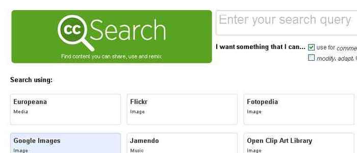
An important part of the most of web designs are the images. Using images is almost a must, but there is a little detail. You, as a person more skilled in “using the left side of the brain”, are more likely to have problems with this topic. This is something that you can not change (at least easily). There are alternative ways to solve that lack of skills. Thanks to licenses as Creative Commons and a ton of contributors worldwide you can find images that you can use even for commercial purpose. The contributors require some conditions in order to let use their work. The basic condition is the attribution, but some other contributors would like that you share your derivative work the same way they shared their work with you (share alike). Some other websites such as Iconfinder can help you find those little images for specific things with similar licenses.

There would be some cases that you may like to add a specific texture to your web design. Doing this without images will be pretty difficult. That is the reason why searching for free-shared images on the web it is necessary. Despite all, this is not a warranty that you will never be needy of images. That is the reason why knowing how to edit an image (Photoshop, The Gimp, …) is encouraged. Although this would be the most difficult part of the solution. Is the only way to make sure that you will be able to handle kind of situations.
Things to keep in mind
Get the best of your functionality skills
Knowing how things work in the background and some basics of design (the act of make something look good yet functional) is a big asset. With that knowledge you can improve the performance of the website. Find better approaches for problems related with web design, and much more. This will let you improve the maintainability of the template (the web design in physic) by doing these activities;
- You can identify any style that might be repeated and define it in the code in a way that can be implemented easily another where else.
- You can make the images seamless (an image with similar borders). If you can divide the elements of an image into multiple elements and transform one of those elements into a seamless image it would improve the performance of the whole website drastically.
You can not replace a designer
Unfortunately, that is an unavoidable truth. They (designers) handle more concepts of color, images, and how to attract the user attention with those elements more than you. Maybe you can improve your skills over time, but if you really want to become a web guru (if it really exists). The only way to achieve it it is with time (I mean years, a lot of years) with no warranty that you can really become one of them. Remember that everyone has a role and innate skills. Anyone can improve his ability with any skill. There is no ability easy to learn. If you want to become skilled on something that is not your innate skill you must effort to do it.
Get some help
This article was intended to give guidelines to programmers with a lack of design skill in order to help them complete their own projects if they can not afford a designer. It was not intended for helping replace a designer in a professional work that needs deadlines and tough requirements. Even if it is your project and you really need to get a professional design. getting some help is highly encouraged. Teamwork is the best way to solve any problem and develop any project.